
In the ever-changing fashion industry, branding plays an important role. A logo, most commonly a founder’s name or a monogram, allows customers to identify products and can also influence the perceived value of a brand.
The evolution of logos is a public statement that a company has undergone a transformation that consumers should take note of. The reasons for this can be completely different – a change in creative director, direction of activity, the need to meet modern requirements, or a way to deal with competitors.
Over the past few years, premium brands such as Balenciaga, Saint Laurent and Burberry have seen a trend towards similarity and simplification of logos. According to experts, a minimalistic design allows you to better protect your intellectual property. In a 2018 article, The Fashion Law, a leading source on fashion law, wrote that the distinctiveness of signs “depends on the word itself, not on its stylization.”
Another possible reason why fashion brands are starting to use simple logos that make them barely distinguishable from each other could be that luxury goods sales are particularly frequent online. By choosing an emblem that is easy to recreate on digital and physical platforms, fashion houses can present themselves in the same way in all settings, relying on recognition rather than distinction. A large collection of fashion logos is collected on the “LogoLook.net” resource.
Balenciaga
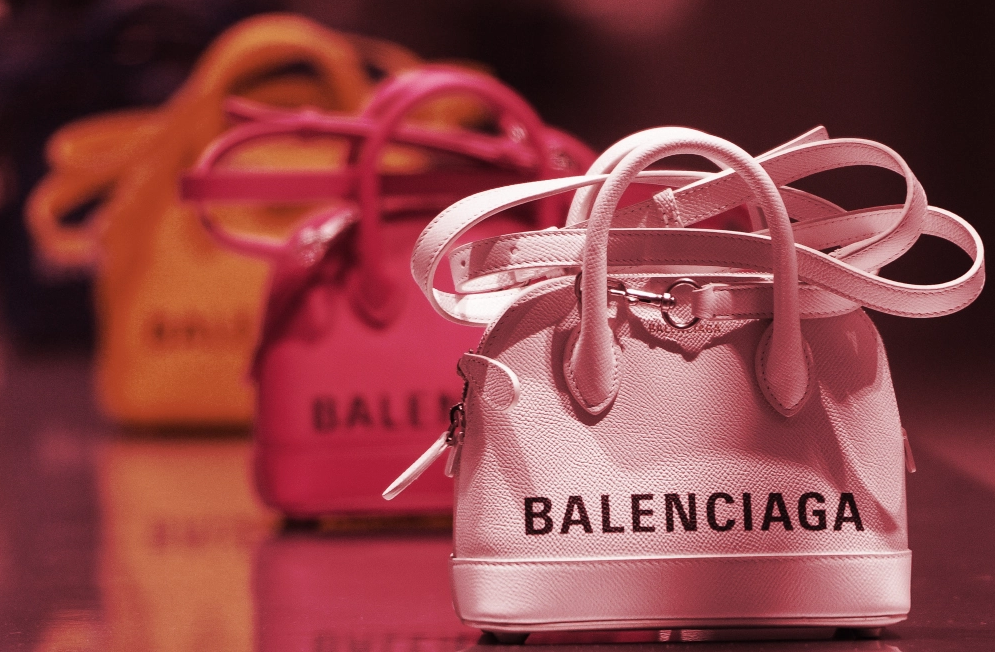
Cristobal Balenciaga started his business in 1919 by opening a small boutique in Spain. He later settled in Paris and in 1937 showed his first couture collection. The fashion designer signed his creations with his own name. The logo included in the tag consisted only of the designer’s last name and the inscription “Maison de Paris”. Since 1970, it began to appear along with the mirrored “B” monogram, and the words “Maison de” were dropped.
In 2017, a new chapter in the history of Balenciaga began – the iconic logo of the Fashion House experienced another metamorphosis. Inspired by the laconicism of public transport signs, Demna Gvasalia created a new minimalistic black logo, removing the city name and the double “B”.
Balmain
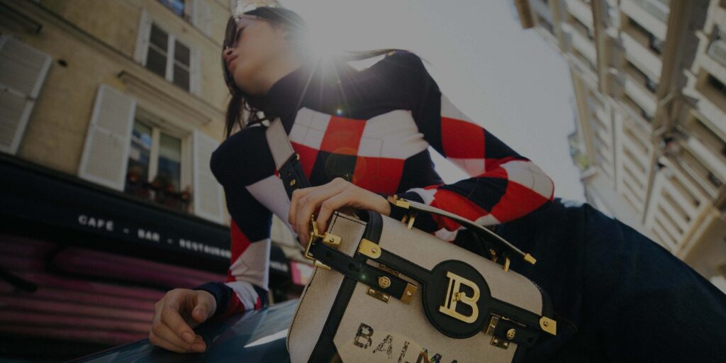
In 2018, Olivier Rousteing designed a new logo for the French fashion house Balmain. Updated for the first time since 1945, that is, since the opening of the company itself, the font has become shaded and more minimalistic, without the usual serifs. In addition to the brand name, the letters “B” and “P” woven together were also added to the symbol, referring to the founder of the brand of the same name, Pierre Balmain, as well as to Paris.
Rusten, who has been at the helm of the company since 2011, wrote in an open letter to the press that the new logo better reflects the brand, while at the same time honoring its past. “Balmain is a fast growing brand that uses new platforms to communicate with a global audience. But in order to move forward, you must first be clear about where you started. That is why, at every stage of the redesign process, I emphasized that it was necessary to refer to the familiar design that Balmain created for his atelier more than seventy years ago, ”the designer explained.
Burberry
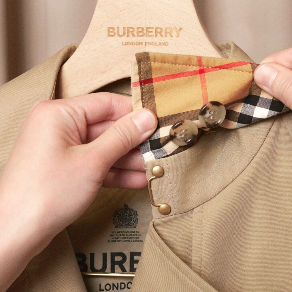
The British fashion house Burberry was founded in 1856, but the iconic knight on horseback logo was not created until 1901. In addition to the capital letter “B”, the flying flag was inscribed with the Latin word “Prorsum”, meaning “Forward”. Always concerned about protecting the interests of his business and products, the founder of the Fashion House, Thomas Burberry, registered the logo in 1904. The horse symbolized purity, nobility and honor, and the rider’s shield meant protection.
Over the next century, the symbolism underwent some changes. In 1968, the image of the knight on horseback became small and completely black, without much detail. Under the brand name appeared the inscription “of London”. In the 1999 version, the logo no longer contained the preposition “of”, and the founder’s surname began to be written in capital letters.
In 2018, Ricardo Tisci became the creative director of the House, who once again updated the symbolism. It’s worth noting that this time the changes were more drastic – there was no longer any knight, instead just “Burberry” and “London England” underneath. The new design was done in collaboration with Peter Saville, best known for creating the iconic Joy Division album cover.
Celine
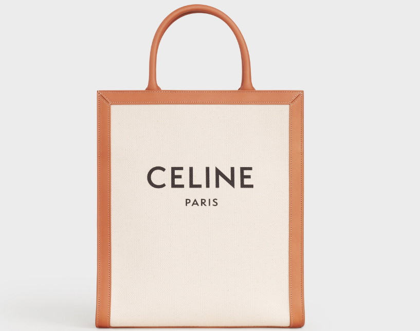
In 2018, Hedi Slimane marked his start as CEO of Celine by removing the accent above the é in the house’s eponymous logo. Previously, the emblem of the company, which in 1945 Celine Vipiana created with her husband Richard, reflected the name of the founder, written in the French manner.
The rebranding was made public on the company’s Instagram, at the same time all previous photos of Celine were deleted. According to the post’s caption, the change was inspired by the 1960s collections, which often omitted the axant in their designs. The new logo used modernist typography from the 1930s and narrowed the spacing between letters.
Fendi
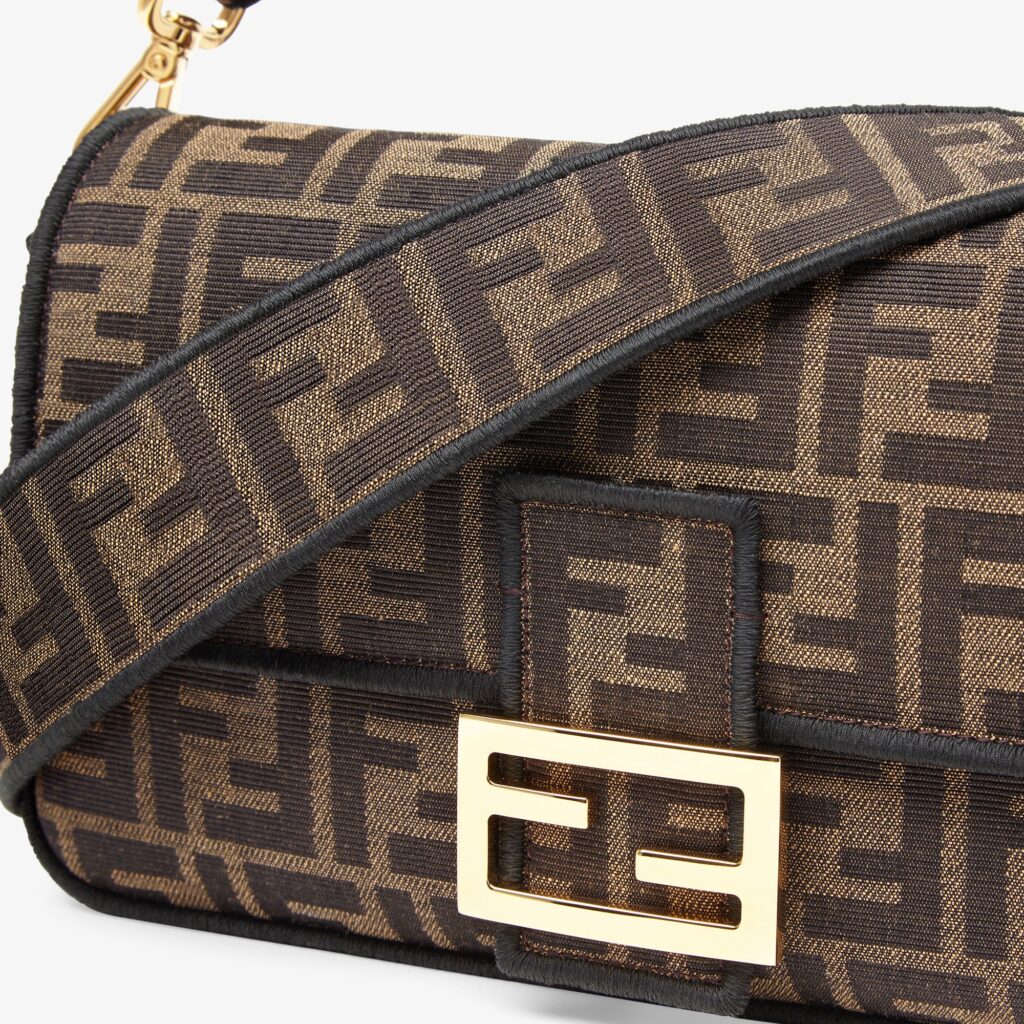
The very first logo of the Italian company Fendi, founded in 1925, depicted a squirrel on a branch with a nut in its hands. In an interview for The New York Times, Silvia Fendi said: “Eduardo, my grandfather, gave my grandmother Adele a small picture of a squirrel, as she was always busy and worked all day like a squirrel in a wheel. And then she decided to use this picture to refer to her products.”
In 1965, Karl Lagerfeld developed the famous inverted F combination. “I drew [double F] in three seconds and it became an acronym for the House [Fendi],” he recalled in Loïc Prijean’s documentary Karl Lagerfeld Paints His Life.
In 2013, the House removed the monogram from the logo, but continued to use it in fashion designs, sometimes showing an “F” inside a circle. The modern version is the brand name and the Italian designation for the city of Rome.
Kenzo
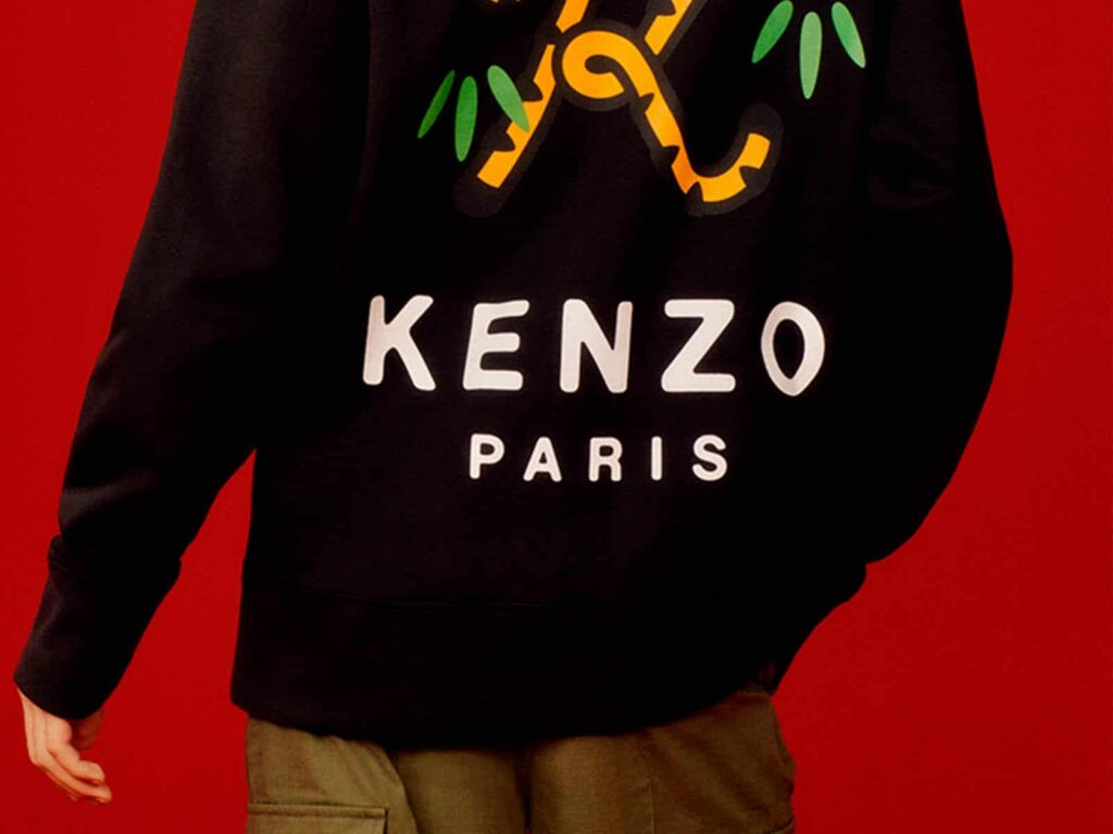
Kenzo began a new era with the arrival of Felipe Oliveira Baptista in 2019 as Creative Director of the House of Kenzo. A month before his debut collection for the Japanese brand, he introduced the new Kenzo logo. The modern adaptation of the emblem began to resemble the original 1976 version, registered by Kenzo Takada six years after the company was founded.
Graphic branding, which the fashion house describes as an important part of its visual identity, was developed as a building game “because its ability to transform allows creative expression” (Vogue, 2020). The three-stripe letters featured in the previous logo, which the brand has been using since 2011, are gone, replaced by bold black lettering. In addition, the designer removed the name of the city, which was enclosed within the letter “O”.
Loewe
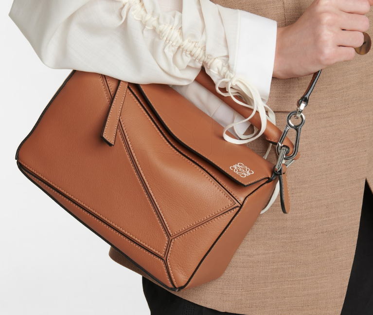
Loewe was founded in Madrid in 1846 and during this time has managed to change many logos, mainly consisting of the brand name, city and crown. In the 1970s, the company began to expand worldwide. At the same time, a logo with four interlaced “Ls” was created.
From 2000 to 2014, the branding of the Spanish House was the bold spelling “Loewe” and “Madrid”, “1846” below it. It was changed after the arrival of new creative director Jonathan Anderson.
The fashion designer invited the design firm M/M Paris to cooperate. The partners changed the font weight and brought back the reconstructed anagram of the brand – a quadrangular emblem, giving it a more streamlined look.
Maison Margiela
The history of the Margiela Fashion House began in 1988. Then the Belgian designer Martin Margiela named the company in his honor – Maison Martin Margiela. Dozens of years later, in 2015, the name of the founder of the brand was removed and the French brand became simply Maison Margiela.
Unlike Saint Laurent, here the rebranding went quietly and without press attention. The company just printed a new logo on the invitations to John Galliano’s first collection for Margiela. “The new leader is a new name that reflects the evolution of the House,” the brand commented informally.
Off-White
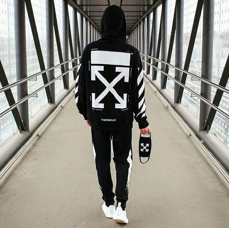
Founded in 2012, the young brand Off-White has become synonymous with diagonal stripes and crossed arrows. However, in 2019 it changed its logo. Introduced by Virgil Abloh, the emblem included the words “Off” and “White” separated by the silhouette of a drowning man’s face with hands under each word.
A possible reason for such changes could be numerous scandals related to allegations of plagiarism. In 2018, Helly Hansen denounced Off-White for copying white stripes. The Scandinavian brand claimed to have used the design for 36 years before Off-White registered it as their logo. In the same year, an anonymous Diet Prada insider posted on Instagram a photo of Glasgow Airport in Scotland, in which you can see the same crossed arrows as the brand.
Saint Laurent
The original Yves Saint Laurent logo, emblazoned with large cursive letters “YSL”, was created by graphic artist Cassandre (real name Adolphe Mouron) immediately after the company was founded in 1961. In this form, it lasted more than fifty years. In 2012, Hedi Slimane took over as creative director of the Fashion House, and one of his first steps was to change the company’s logo.
The designer has completely ditched “Yves” and replaced the classic spelling with a minimalistic Helvetica font. In this way, Slimane paid homage to the Saint Laurent Rive Gauche boutique, which opened in 1966, and Yves Saint Laurent’s first Ready-to-Wear line.
A spokesman for the company told WWD that the designer wanted to restore “the purity and essence of the House” and start “a new era while respecting the original principles and ideals.”
Versace
Gianni Versace founded his company Versace in 1978. But only two years after the founding, the designer presented the first logo of the brand, which contained only the name – “Gianni Versace”, written in thin type in one line. Ten years later, it became more voluminous, and the name and surname began to be located one under the other. In 1993, the company demonstrated the famous head of Medusa.
There is speculation that the symbol of the Fashion House is based on an image that Gianni and his sister Donatella saw as children. They often played in the ruins of a mansion in Rome, which had a similar design on the floor. Gianni probably assumed that his clothes would evoke a similar feeling of attraction. The designer wanted his collections to be as shocking as the Medusa look.
Since then, the Versace logo has undergone minor changes in font and details, but the overall outline has not changed. After the premature death of the founder of the house in 1997, only his name was used, located in an arc under the icon. In 2008, the inscription acquired an even horizontal appearance, and the gap between the letters of the name increased.


