
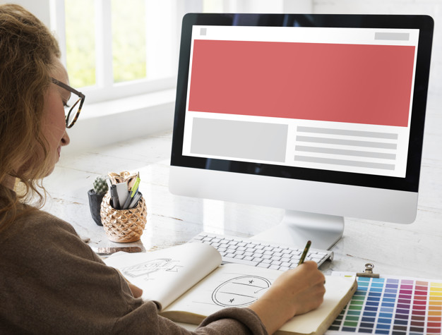
Today, many creative professions are associated with computer work. One of the most interesting in the field is the specialty of a web designer. To obtain it, you do not need to go to college, it is enough to have good taste and learn the skills of working with specialized software for website design. Click here.
The Internet became generally available at the end of the last century. At the same time, there was a need for professionals who are able to create sites, their beautiful design, and optimization.
There are no specific job descriptions for the high-tech design professions. Therefore, the list of what a website designer should be able to do is not limited to specific positions. The more skills an employee has, the higher his demand, the level of earnings, and the number of orders will be.
Competition in the direction is growing every year, so the ability to select colors, fonts, or pictures no longer surprises anyone. An attractive web page is now able to make not only a student at the university but also a simple schoolboy who is keen on a computer. Highly qualified web designers create site layouts taking into account all the wishes of the customer. In doing so, they take into account the technical characteristics that affect the download speed of the resource, its attendance. The modern representative of the profession is an experienced computer marketer. It ensures the promotion of goods, services, attracts customers, increases the customer’s profit.
The sites that fill the world wide web are very diverse since each resource has its own criteria. They cannot be classified, but they can be distinguished by the type of design, which comes in two types: hard and rubber.
The design of sites of a rigid (fixed) type is a tabular view, which has a cell expansion in the form of pixels, pictures, or other elements placed in this cell.
Flexible type, is a tabular view with the width of the cells, depending on the percentage of the width of the window.
Rigid design

This work is much easier to design since each element has a fixed width and is located at a certain distance from the other. Such a project will have a constant layout for all users, regardless of the monitor size or special window size parameters. This approach is based on the design principles of publishing pages, such as the relationship of elements on the page, maintaining a constant grid, and convenient line lengths.
The advantages of a rigid type website design:
- The page remains unchanged regardless of the monitor. This increases the scope for creating stylish and sophisticated looks.
- Easy row length control thanks to fixed column and row widths. Very long lines are difficult to read.
Disadvantages of a hard-type site:
Fixed design, as footer design, has only one kind of optimal screen resolution. If during creation, the emphasis was on compatibility (with an optimal size of 640 x 480), then if the size reaches 1024×768, the margins will take up half the page width.
If the creation of the site was focused on the “medium” resolution, which is 800×600 pixels, then users who have small monitors will see a horizontal scroll bar and incomplete page content. Most developers are guided by their own monitor (1024×768), while most users use an 800×600 pixel extension. Thus, the page will look bad, and when the monitor is enlarged to 640×480 pixels, it becomes unreadable.
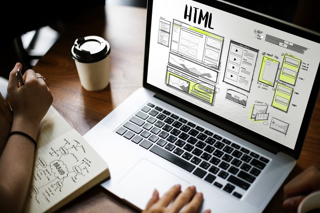
The desire for complete control over the displayed page is a kind of opposition to the environment. The web cannot be classified as a print publication because it does not have “correct standards” and HTML is a universal logical markup language.
Adaptive design
Considering the disadvantages that the rigid type has, you can take advantage of the flexible design. By default, Web pages are flexible. The HTML file and text elements fill all the available space of the browser window, regardless of the monitor resolution. If changes are made to the browser, the elements will adjust to the new parameters. This is a special design of web pages that presupposes the preliminary segmentation of users by the type of device from which they logged on to the network. After performing the “analysis” of the gadget, the adaptive service displays the version of the site that will be most comfortable for viewing in a browser window of a specific size. For example, PC users are offered a “full-fledged” version (with all pictures and descriptions, buttons and titles), smartphones – a simplified version of the site (only necessary blocks and elements, lower resolution photos).
The advantage of using responsive design:
- Pages are displayed on any monitors. It can be configured on any display for output.
- The entire space is filled, covering the unwanted empty space.
- The style is closest to HTML.
- Disadvantages of flex type:
- Large monitors display very long lines that impair normal readability.
- Flexible design has unpredictable results.
Browsers have a hard time dealing with variable width cells. Anyone who has written compatible HTML knows that a cell width of 100% will not take up all the available space, and standard size will take more than it needs to. Since there are quite a few devices that users use to access the network, there should be no fewer versions. Thirdly, when revising and editing pages, they will have to be finalized and edited in all versions. In addition, you need to carefully make sure that adding responsiveness to your site does not “slow down” page loading. Therefore, when developing and creating an adaptive site, it is wiser to enlist the support of a qualified team of web specialists who will support the virtual project on the network.
Combined approach
Each type has its own advantages and disadvantages, so the choice is up to the developer. Sometimes, website designs can be created using a combined approach. It represents a page in the form of columns with specified combinations of relative and absolute sizes. In this case, if the window size is changed, then one column will remain the same size, while the others at this time change size, filling the free space. This method is preferred in most cases.
Thus, the choice still remains with the creators. Style has no strict rules and laws. Nevertheless, the best option for a domain is the rubber option, which, although time-consuming, will be more user-friendly and closer in spirit to the main idea of the web.


